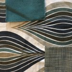
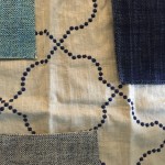
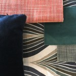
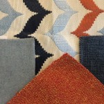
Palette building is my jam. It is usually inspired from a piece of artwork, a rug, a favorite colour, a fabric a client has fallen for. Sometimes? All of the above. But where it goes next makes all the difference between loving your interior for now and loving it for always. (NB: Loving for always is hyperbole but sounds better and more committed than “for a long bit.” I am talking about accessorizing after all so “a long bit” works.)
Start Here
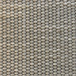
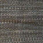
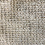
Always keep your expensive, hard to swap out pieces like sofas neutral and the neutral list is growing in my book so don’t feel limited. Light-ish? Yes – including greys, both warm and cool, white through beige and taupe through browns. And use textures to make your upholstery forgiving. Those lovely solid linens? Please don’t unless you live alone and travel a lot and don’t have pets or kids or a husband or windows.
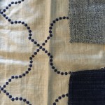
But on my neutral roster of late is navy blue. It makes for a great basic and pairs beautifully with more than you think it does.
Layer Up
Now fold in that colour you have been coveting and use it on occasional chairs and for cushioning, even the objets you are adding to the space. If you have a patterned rug, watch the scale and busyness of your fabric patterns. Stick to two tones with a relatively small repeat. If you are dealing with a neutral rug, have at it. Bold pattern will pop.
If you are using a strong pattern, that may very will be your starting point providing some guidance on what to fold in next. Pull everything you can from your pattern but only use one – one statement per room, remember? You should rely on textures and chunkier weaves to bring in some variety. And don’t be afraid to go off tone – variations in your colour will give the room interest. Resist the need to be matchy-matchy. It will also make it easier to add to – matchytown is tough to move away from. Give yourself some room to flex a bit.
Surprise!
Now add something completely unexpected. It can be a compliment to the colours you have pulled from your pattern or completely off message. In balance and proportion, it will liven your space and make it look finished and accidental – not like those interiors that look too overdone and designed. For example: add one toss cushion in a contrasting or complimentary colour and a couple of objets in the space – a gorgeously bound large scale book and a bowl or sculpture on the coffee table. Trust me.

