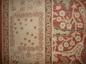
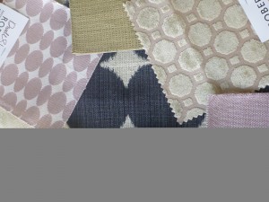
Twice this month, I have been charged with reinventing a room starting with something a client hates. Both cases: a rug.
Best quality rugs are a massive spend and not easily swapped out when your design tastes start to shift. But incorporating it doesn’t have to be a project stopper. Open your mind a little bit.
Look Closely
A traditional Persian is a good investment – it will keep its value and they tend to be primary, offering lots of flexibility. It is safe. But it is primary. And it is safe. Yawn. Snore.
However, have a second look – in and among the blues and reds, you will be amazed at what you find. Plucking a shade from obscurity is completely on side and will let you get more mileage out of your rug.
My first rug stumbler had me reconciling a primary Persian with the client’s desire to embrace the more contemporary greys and marry the living room with the dining room’s putty chairs. A leap, yes. The grey was an easy upholstery choice – it really does go with everything. But where to start with the layering.
Nestled around the expected Persian palette were pops of teal – a modern green blue that is abundantly available in fabric. Statement fabrics are key when you are trying to draw the eye away from something so don’t shy from pattern and generous layering. Matching and balance are not invited to this party.
Interpret It
 My next stumbler was a Romanian rug – stunning and well paid for – but the colour scheme wasn’t working. The soft green and charcoal I could work with but the raspberry needed to be toned or all out ignored.
I landed on a nude blush – a much softer version of the raspberry’s former self and ultra modern to boot. I love the way it plays with grey and the green. And I opted for lots of layering and pattern play – a little distraction  goes a long way. The rug isn’t nearly as focal anymore. Love.
The same method can be applied to any colour you find yourself out of love with.
There is always a current, fresh interpretation, shade or tone to consider.
